And so we move on to Cornucopia. It's the heartiest expansion, full of feast, glory, and gloomy people. Fun times shall be had by all.
18. Tournament
This looks like it was drawn with colored pencils during the middle of a Medieval Literature course, quickly adapted into a card, and turned in at the last minute. Taylor Bennett didn't contribute any other art for Dominion, and honestly, it's not hard to see why here. The perspective is all off and the colors don't mesh well. With that said, it's better than a lot of other art in Dominion. Cornucopia is simply a step up from previous expansions in terms of art.
17. Bag of Gold
This is a bag of Gold. It's... fine. What do you want from me?
16. Diadem
Would Voldemort have worn this on his head? Maybe. I don't think I'd have hidden part of my mortal soul in it, though. It's pretty cool, I guess. I dig the swirl in the gem, and the background colors suit the diadem itself. Whee.
15. Hunting Party
Donald X has pointed out technical inaccuracies with the scene here in the past, and that's all well and bad. Aside from that, the scene itself is difficult to see on the actual card due to the contrast between the trees and animals. That has to count against it. I wonder if this is secretly some sort of Satanic sacrifice ritual; I'll have to ask my local deer.
14. Followers
Well, speaking of Satanic rituals...Thematically, this card always confused me. It looks more like an angry mob of peaceful protesters picketing the government than some meanie followers I need to be looking out for.
13. Remake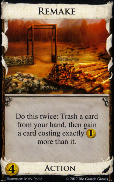
Remake, much like its cousin Upgrade, is still in development. The red, vampiric fog is setting in, threatening to morph this pile of wood into an Ent demon. What is being remade here, anyway? The... other word for arch... there? What happened? Did someone buy a couple more feet of land and needed to set their wall a little bit farther? Imagine being the worker getting exploited to do THIS project. No wonder those protesters were up in arms.
12. Princess
The Princess is cute, neckless frame and all. She carries a bow, has a friendly golden eagle friend, and is starring in an anime. I do have to wonder what's with her eyes. Perhaps we have finally found the source of the undead scourge haunting the realms of Dominion.
11. Trusty Steed
This image is begging to have a top hat and monocle Photoshopped in. Someone page the guy who does all that. While the Steed stands in a rather dull scene, s/he is quite attractive, befitting of the title. I'm not completely sure about the lighting on the blue plates there, but it looks nice enough that I can withhold criticism. Now somebody get this poor horse into the barn before the storm starts.
10. Fairgrounds
In before that one guy complaining about how I just don't ~get~ this deep, special picture. Dude, it's fine. I'm not even rating it that low. Lay off! Anyway, as I've said before, this is a rather drab depiction of a Fairground, not what you'd expect an artist to draw when assigned to do so. Though I have a bit of a post-punk attitude myself, I think a livelier scene may have fit the expansion better. Still, if the gothier vibes are what you want, here's your card.
9. Horse Traders
The group of shady Horse Traders exited the Ghost Ship, ready to pawn their wares off on the unsuspecting. Little did they know, their bodies would begin crumbling into an alternate dimension and they'd shortly be jousting in a tournament in a land where realism had been thrown out the window. This card is blue. The guys are all unique and expressive, and the horse seems the smartest of the bunch. It's a lovely image that makes the Reaction border pop.
8. Fortune Teller
A moment of silence for Ms. Cleo. I like everything about this picture. The outfit is classy, particularly the peacock feather hat. The pose, with the Fortune Teller gazing into a jewel to predict the great Bacon Rains of the next fortnight, is aesthetically pleasing. Even the candles mysteriously glowing in the dark room within the curtains add something here. And we're only at #8, folks. It's just shy of being in the top tier of Dominion art.
7. Young Witch
Now HERE'S the winner of the Goth Rock Beauty Pageant. She doesn't care about you, this world, or any of our silly card games. The Bane is a Katy Perry record. There's a great atmosphere here with the gray mist and twisty tree. Her dress is finely tailored (you can buy one today at your local Hot Topic) and her pose cute and funny. I suppose this card fits the theme with Fairgrounds, but I feel it is more successful and relevant to the card title.
6. Menagerie
Menagerie is unique in the Dominion world; who knew we'd get an animal exhibition when this game began? I like how the trees accentuate the bright atmosphere of the event, and the giraffe eating out of the child's hand is too cute. It's a nice, warm picture that fits the variety theme of the expansion perfectly.
5. Farming Village
A beautiful scene, complete with vasts fields of hay and even a butterfly. Some might say this is one of the less useful Village cards, but at least your deck will look nice with them around.
4. Hamlet
Sometimes a scene doesn't have to be particularly striking or unique to be great. The Hamlet is finely detailed and well-constructed, with a fine dirt path and excellent shadow work. The little guy gets to win every once in a while. I do wonder what the man in the foreground is planning to do with that pipe, though.
3. Horn of Plenty
Horn of Plenty is the centerpiece of the set, and it's a very fitting one. The wealth of fruits, gelatin, escargot, and chicken wing juice make a fine feast worthy of a patrician's deck. The still-life is a subject ancient as time, and today's artists can just crank one out like it's nothing for a picture on a card these days. We can't deny its effectiveness. If I ever switch to elementary school, I'll hang up a bunch of these at our historically accurate Thanksgiving play, right next to the pile of diseased indigenous people.
2. Harvest
Maybe I'm weird. Maybe I just have a thing for serene, idyllic farmland imagery. Is this too yellow for you all? Let me start a Strawpoll. Those things are even more yellow, dawg! Anyway, Harvest continues the theme of bad cards having great art. Every time I play with this card I want to find some excuse to add more style points to my deck, but it so rarely happens.
1. Jester
Well, duh. That iconic pose, that sinister mask, and those lovely bells work together to create one of the finest human characters on a Dominion card. This image is striking, and was my favorite card art in the game for a long time. It's still up there! It doesn't get more fashionable than all red and a loose choker.
Cornucopia is when Dominion's art got good. Truly, I have few complaints about the art here, and I do wish the standard of quality was always this high. Well, things happen, stuff isn't always perfect. What can you do? The themes of the set are variety and plenty, and the art does evoke it. There's a bit of a random sub-theme of happy vs morose scenes that feels a little strange, but it's not a huge knock against the expansion at all. What we have here is good stuff. Rejoice.
My average rating for Cornucopia is
7.2. In terms of pure numbers, it may not look much better than Alchemy, but it does have more cards, and some of the weaker ones drive down the average.
Current ranking:
Cornucopia 7.2
Alchemy 7.12
Seaside 6.73
Prosperity 6.56
Base 6.4
Intrigue 6.02
The next set to look at is Hinterlands. When will it come? Nobody knows. Least of which me.

