SECOND ROUND OF RESULTSI've made some slight tweaks to the MST algorithm to charge the cheapest connection to a city you've already built in instead of just making it free. I also fixed a couple of error cases/bugs in the underlying functions while I extended their use...
...by simulating a 4-player game, similarly to what theorel has done. Turns out it wasn't
that much work. In doing this I've thought of some interpretations of this data.
The simulation should be seen as a more accurate version of the MST. For the purposes of what I envisioned for this article, I'm going to use the Simulation data. On the other hand, I think there may be some information we can get from the differences we see between MST and simulation, so I computed some extra numbers. Anyways, here's a screenshot of the spreadsheet, which is available in the grid.zip file (linked to in the
OP) along with all of the source and associated files that went into making this.
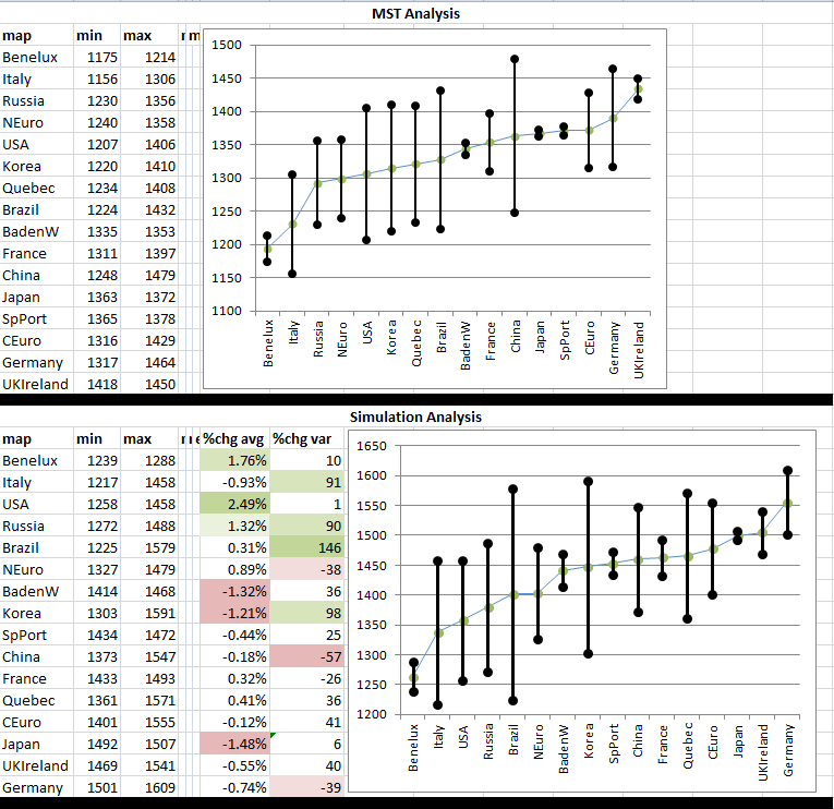
The bars on the graphs represent the range of total map costs you can expect to see in a 4P game. The green dots are just the midpoints of those bars, and the maps are sorted by that value. This should give not only an ordering of the maps but also an idea of the variance in those costs you can expect to see in different games on those maps. As expected, the maps with only five regions have lower variance (Benelux, Baden-W..., and Japan) but hey, look and Spain/Portugal! Who would have thought?
Some more on the numbers behind this, for those who are interested:
So the starting positions of the four players affect the total cost of the map. I thought long and hard for how to deal with this, and while I think there can be some knowledge gained from playing around with this, for the scope of this article I thought it only right to take the minimum of all of those results, to simulate players who are actually playing well. If there are better ideas out there, I'd love to hear them.
So let's try every permutation of starting positions! Well this thing simulates one game in about a half second, so that will take... 85 hours per map. OK then....
I decided to just take 500 random permutations and find the minimum overall cost out of all of them. After letting it do this for about an hour, 500 seemed like it got close enough so there it is. Maybe I could have optimized this thing for performance, but hey normally I get paid to do this stuff so yeah

I saved the particular set of starting locations and costs for each player in the spreadsheet for reference.
The way the cities are bought. Well, they just take turns building their cheapest connection. I decided Step 2 would start at 6 cities and Step 3 would start at 12. In Step 1 or 2, if a player has no legal building options or their only legal connections cost too much, they'll just skip buying that round and buy extra the next chance they get. If it's Step 3 and there are no legal options left, then that particular game is thrown out of the analysis.
The difference between the MST and Simulation results: well there were some changes. Of course the algorithms were different so we expect different results, but from a high level here's what I came up with:
"The MST Analysis simulates 100% collusion by all players to spend as little money on cities as possible. The Simulation Analysis takes a baby step towards simulating competition between players."So maybe that means we can get a result from looking at the differences between the two sets of data. I feel like we could be going beyond the scope of this article here, but whatevs.
Every number went up here, so how much it went up reflects the effect of competition on that map; the more it increased, the more important board position must be on that map, so that's what the "%chg avg" column means. I computed how much the min+max score should have gone up based on an average of all maps and compared that to the result from that particular map. The big numbers (green) here mean that competition on that board did not result in a huge increase. These maps are where board position is less important (if I'm interpreting this correctly). The big negative numbers (red) are where we expect competition over board position to play a larger role.
The "%chg var" column (uhh... that ended up not being a percentage. Hmh.) measures how much those Range-Bars grew or shrunk, since I noticed a big change on some of them. The green numbers mean the bars got bigger and the red numbers mean the bars got smaller. I don't know what this means, so maybe there's a more useful number to calculate here. I might need to think about this some more, but suggestions are welcome.

 Author
Topic: Map Comparison Article (Read 17766 times)
Author
Topic: Map Comparison Article (Read 17766 times)