2. Mine
I think these are some of the best-drawn human (or gnome) characters in Dominion. I particularly like the pose of the foremost miner. That hint of an action adds some depth to the art. Another thing that works for me here is the clothing, all properly wrinkly and fashionable. The mine is a humble set-piece, but with nice-looking inhabitants and excellent lighting and shading, it's easily among the best pictures in the Base Set.
1. Thief
Go figure one of the worst cards in the game has some of the best art. There's excellent use of color here, showing our well-attired, crooked friend sneaking out of a village under cover of the darkness. His facial expression and demeanor reminds me of one of my favorite gaming heroes, Garrett from the Thief series, as well. Also, let's face it: the thief is a stylin' vagabond. He clearly gets all of his shadowy attire from the finest tailors in the land. Tailor, huh. There's a good card name that hasn't happened yet.
Tomorrow I'll wrap up thoughts on the Base Set, taking a look at the box art, the backs of cards, trash pile, base cards, what have you. If you folks want to be interactive, feel free to post your own ranking list of the Base Set here (I'd recommend a single post) and we can see how much you disagree with my wild claims.
So real quick, let's take a peek at the base cards.


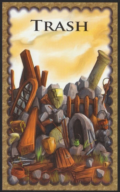
I feel like these were never asking for much. I'm okay with the simple designs, even if I personally think the big coins are a little ugly. The victory shields look fine. I will say I like playing with the original victory cards more than the fancy Base Cards ones simply because the values are larger. I'd say the same for Curses, but man, the new Curse art is nice. As for the original trash pile card, it looks like about what you'd expect, but maybe it's a bit too cartoony for the general tone of Dominion's artwork. Anyway, the original base cards get the job done, but they don't pop.
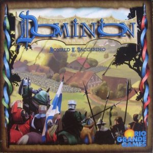
The Base Set's box art feels pretty average to me. It's not as nice looking as a lot of the later ones, and it seems to imply the game is going to have more of a war theme than it does with all those men carrying spears. As such, I feel like the art does not get across the theme of the game very well, inasmuch as the theme is important. I see Dominion as a game of warring economies and property development, not combat. It's not a horrible picture by any means, but nothing inspiring either.

One last little criticism, since Mic has pointed it out to me in the past and I tend to agree. I'm really not a fan of how the backs of Dominion cards look. The logo is a little hard to read since it's blue on a different shade of blue (and that font is less than stylish). Blue and brown is also just a weird color scheme to me. There's nothing that can be done about this now, but for me it's one of the bigger problems with Dominion art overall. It feels like they went with an 'acceptable' that doesn't gel too well with nicer art in later sets.
On to NUMBERS, my overall average rating (out of 10) for the Base Set's cards is
6.4. Most of the art in the set is okay to good, but there are outliers in both directions. We'll see how it all compares down the line.
Next up: Probably Intrigue, but I'll let you guys decide.

